30-Day Chart Challenge
My Tableau Journey
In April 2024, I challenged myself to do the #30DayChartChallenge, creating daily visualizations using Tableau based on specific prompts. This challenge was an incredible journey to sharpen my data storytelling and visualization skills.
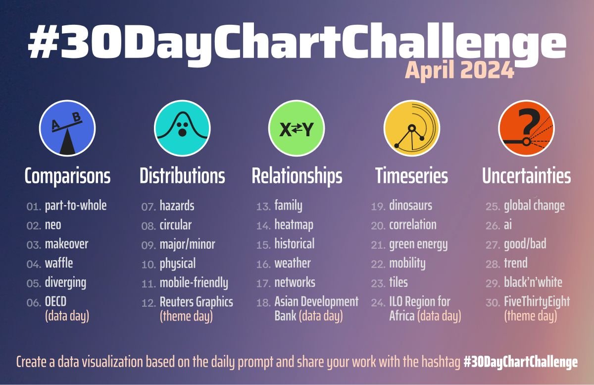 Topic List
Here’s a look at the highlights of my work. I include the link to the Tableau Public page in the image caption.
🟦 Comparisons
Day 3 Makeover
Redesigned a chart to better highlight trends and insights. Showing the multiple phone brand preferences survey. From directly shows as ‘misleading’ bar chart to visualize it using UpSet chart.
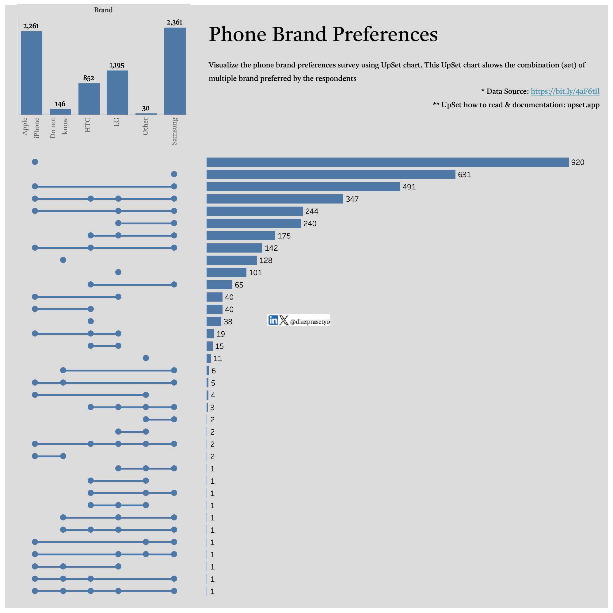 Upset Chart for Visualizing Survey Result
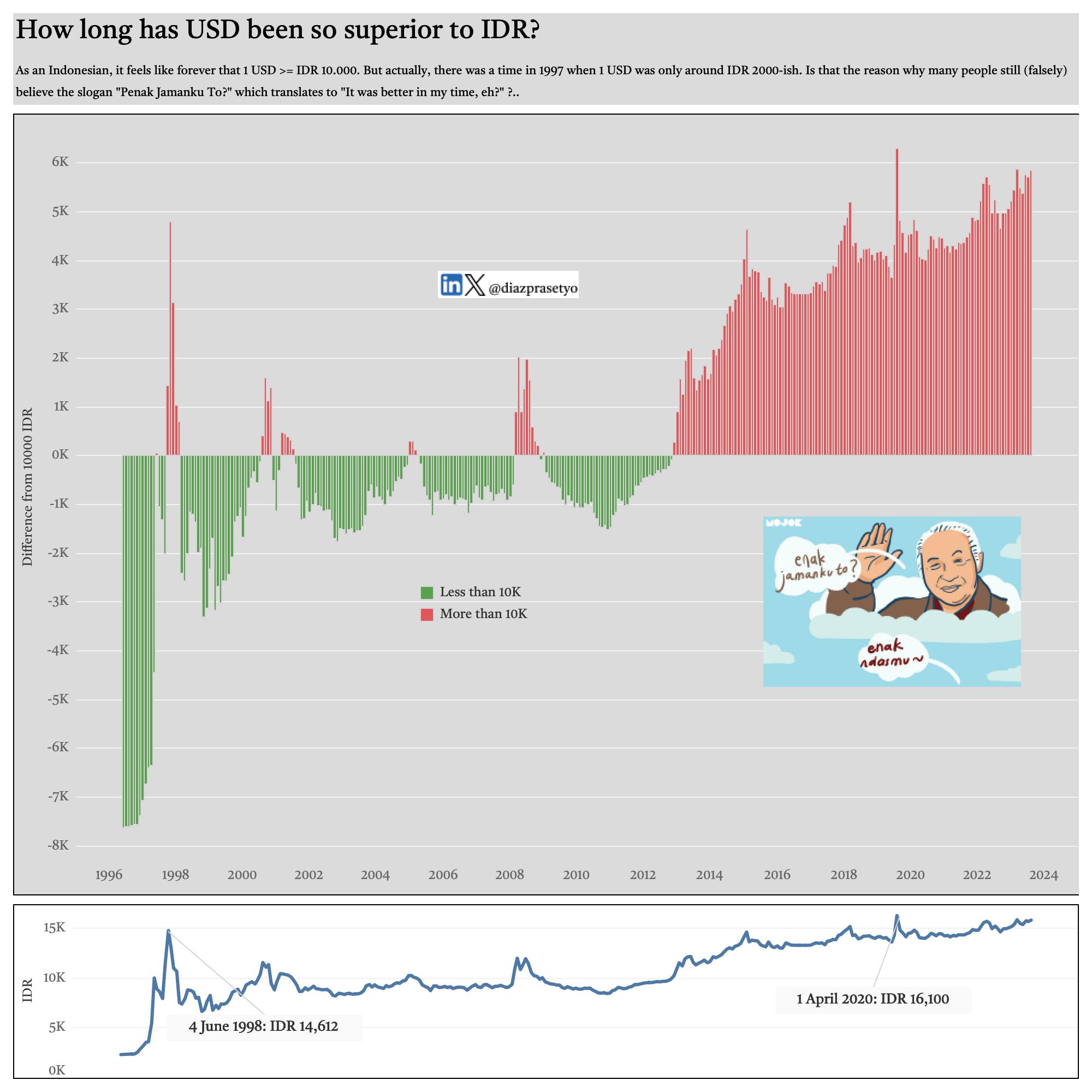
Day 5 Diverging
There was a time in 1997 when 1 USD was only around IDR 2000-ish. Is that the reason why many people still (falsely) believe the slogan “Penak Jamanku To?” which translates to “It was better in my time, eh?” ?
🟧 Distributions
Day 9 Major/Minor
I explored Salary Distribution in Australia fro the role of Digital & Tech in 2024.
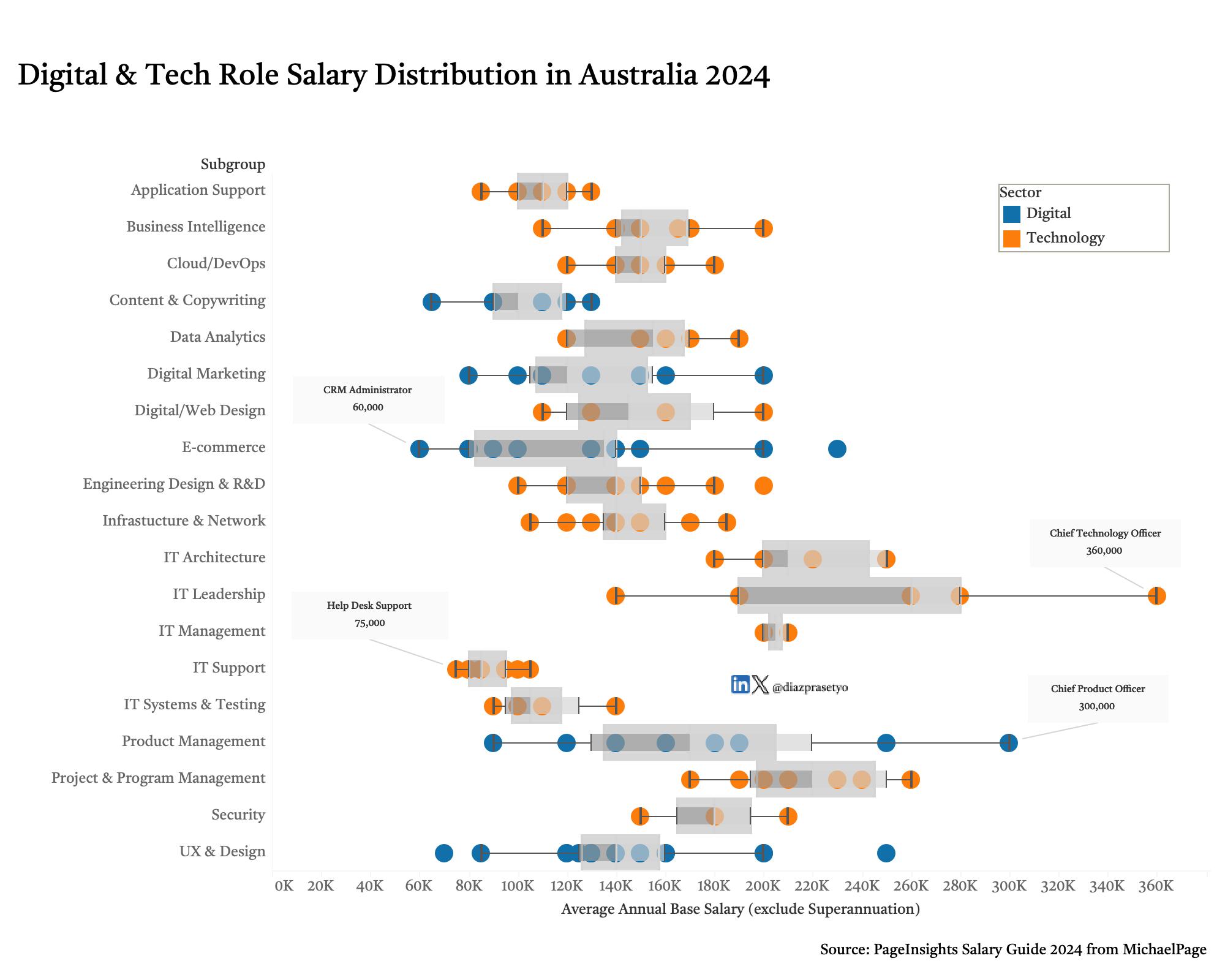 Tech Role in Australia Salary Guide 2024
Day 12 Reuters (theme day)
Inspired by chart from Reuters, I explored Guardian news about the cost of living that has been the most important issue among Australians who voted in 2022 using Bump Chart (credit to @ladataviz). What are the other important issues?
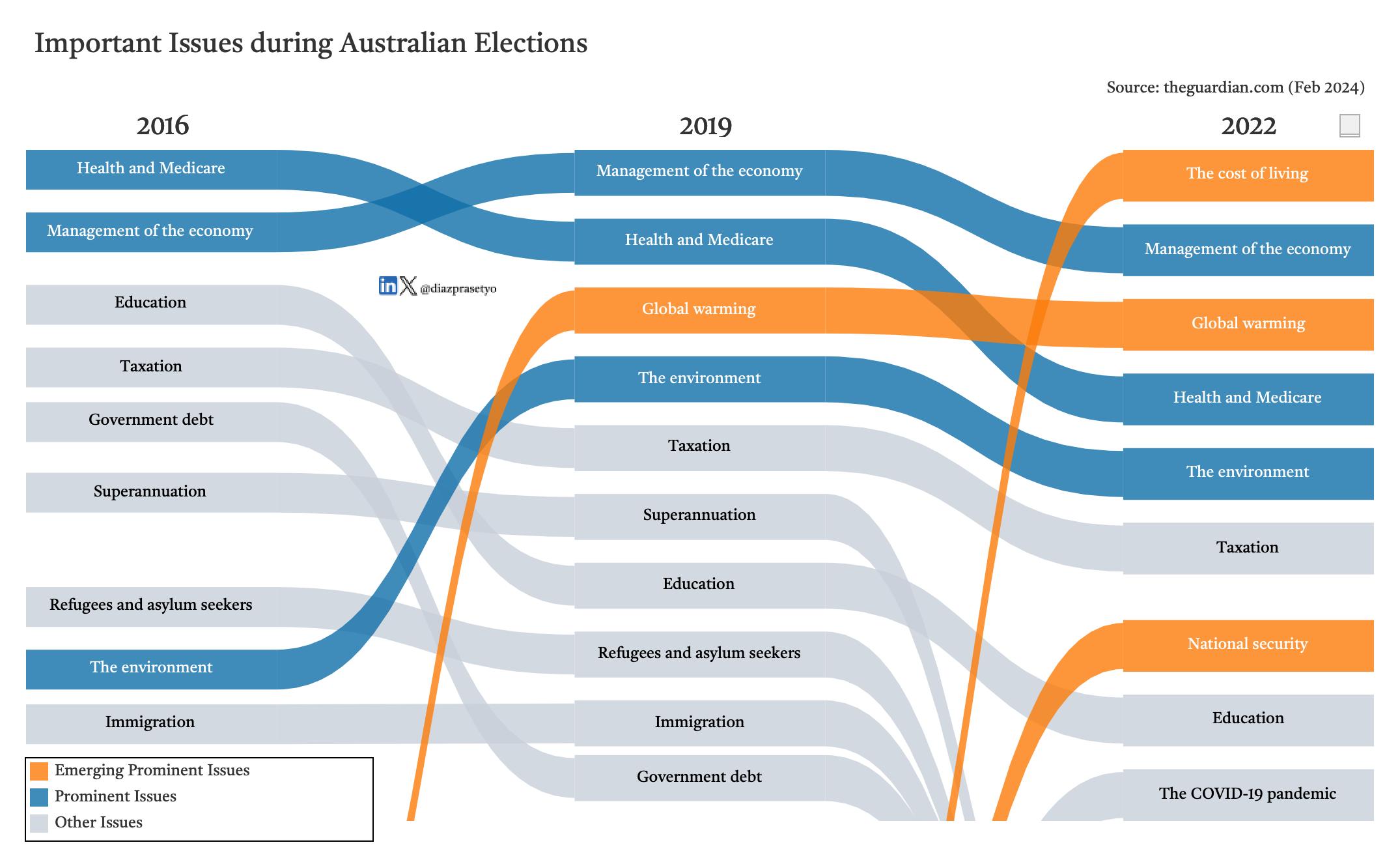 Prominent Issue in Australian Election using Bump Chart
🟩 Relationships
Day 17 Network
I visualized Sydney Train Line into network chart, again with the help of @ladataviz
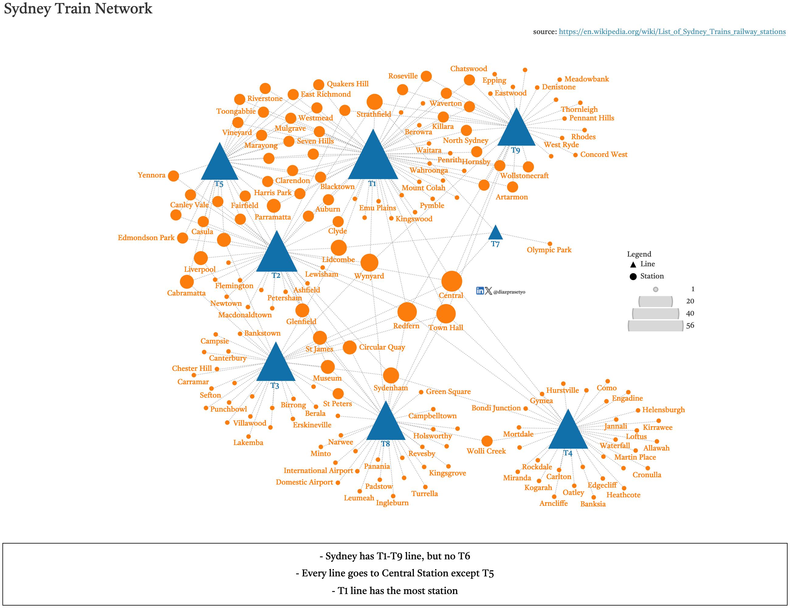 Sydney Train Line using Network Chart
🟨 Timeseries
Day 19 Dinosaurs
Using a Gantt Chart to group dinosaurs’ living timeline by the geologic period and their diet type. Who’s your favourite dino?
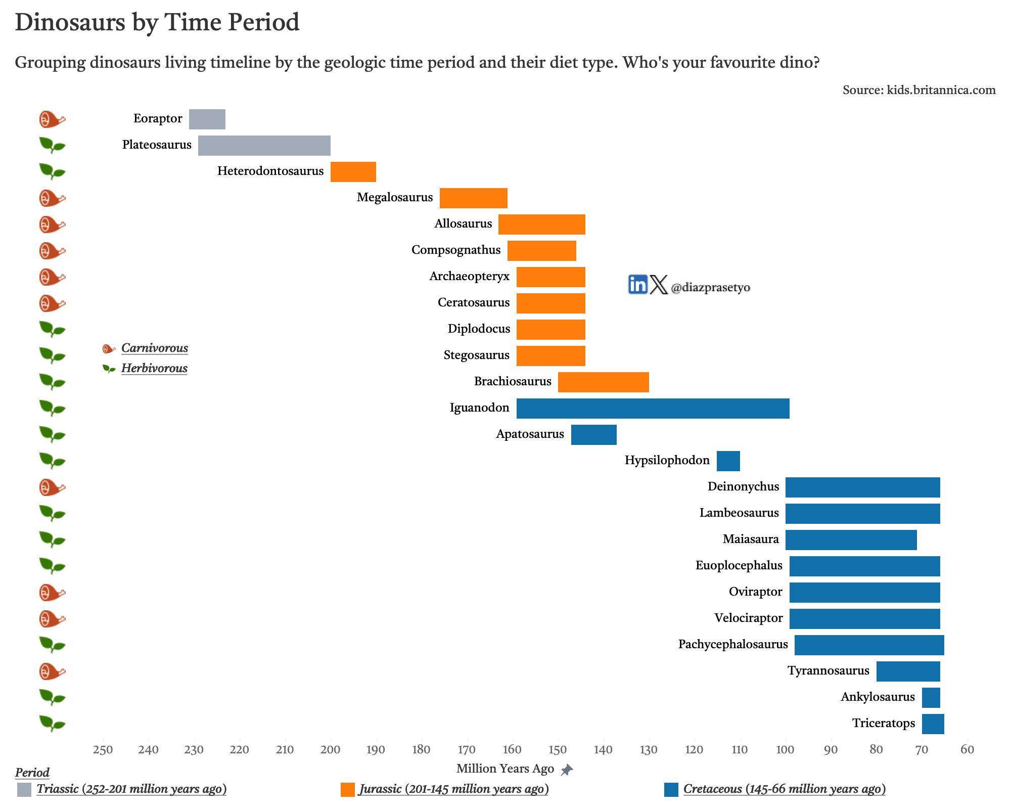 Dinosaurs Timeline using Gantt Chart
Day 23 Tiles
Using tiles map to show the trend of green energy consumption in Europe from 1990-2022
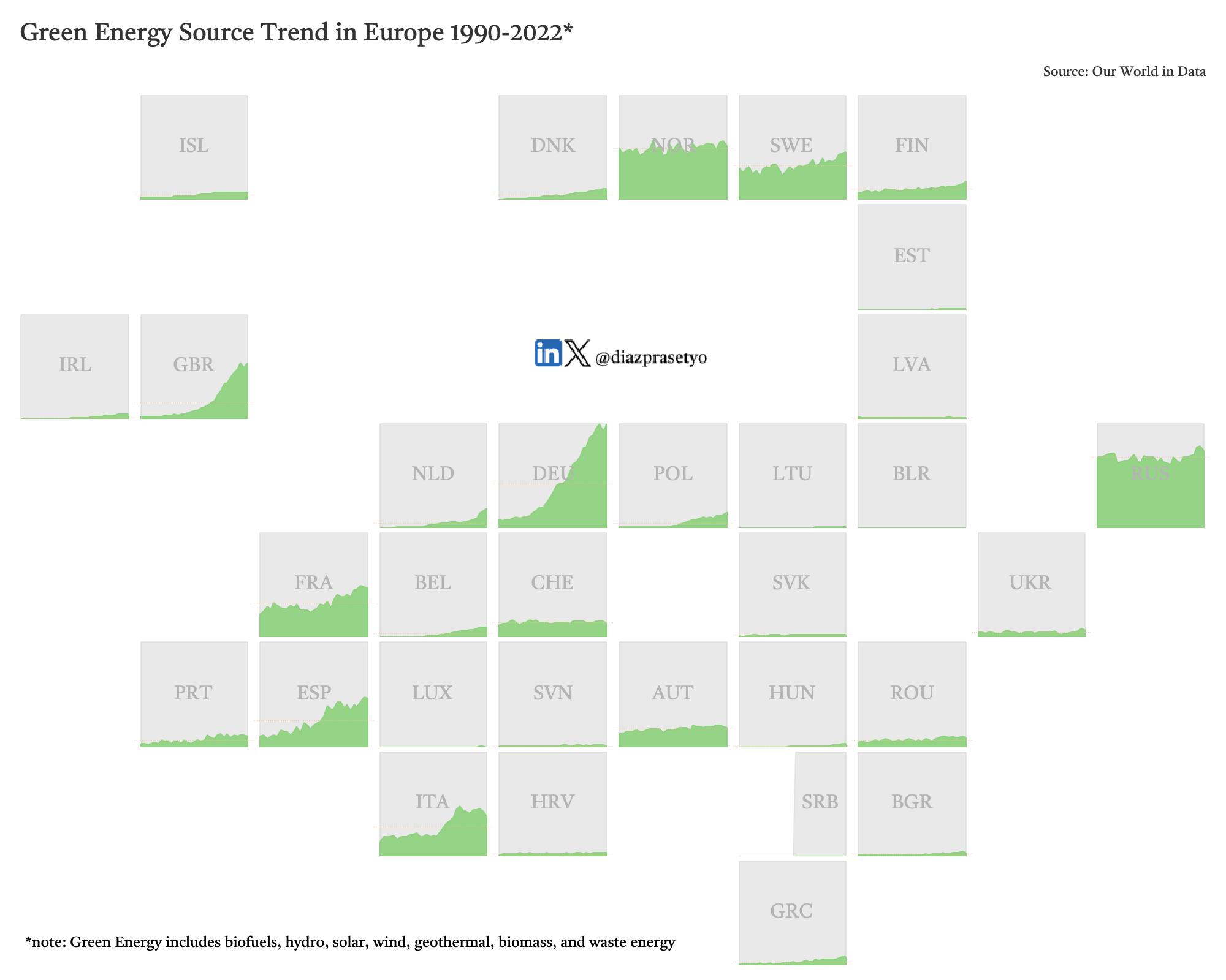 Green Energy Source in Europe Trend 1990-2022
🟥 Uncertainties
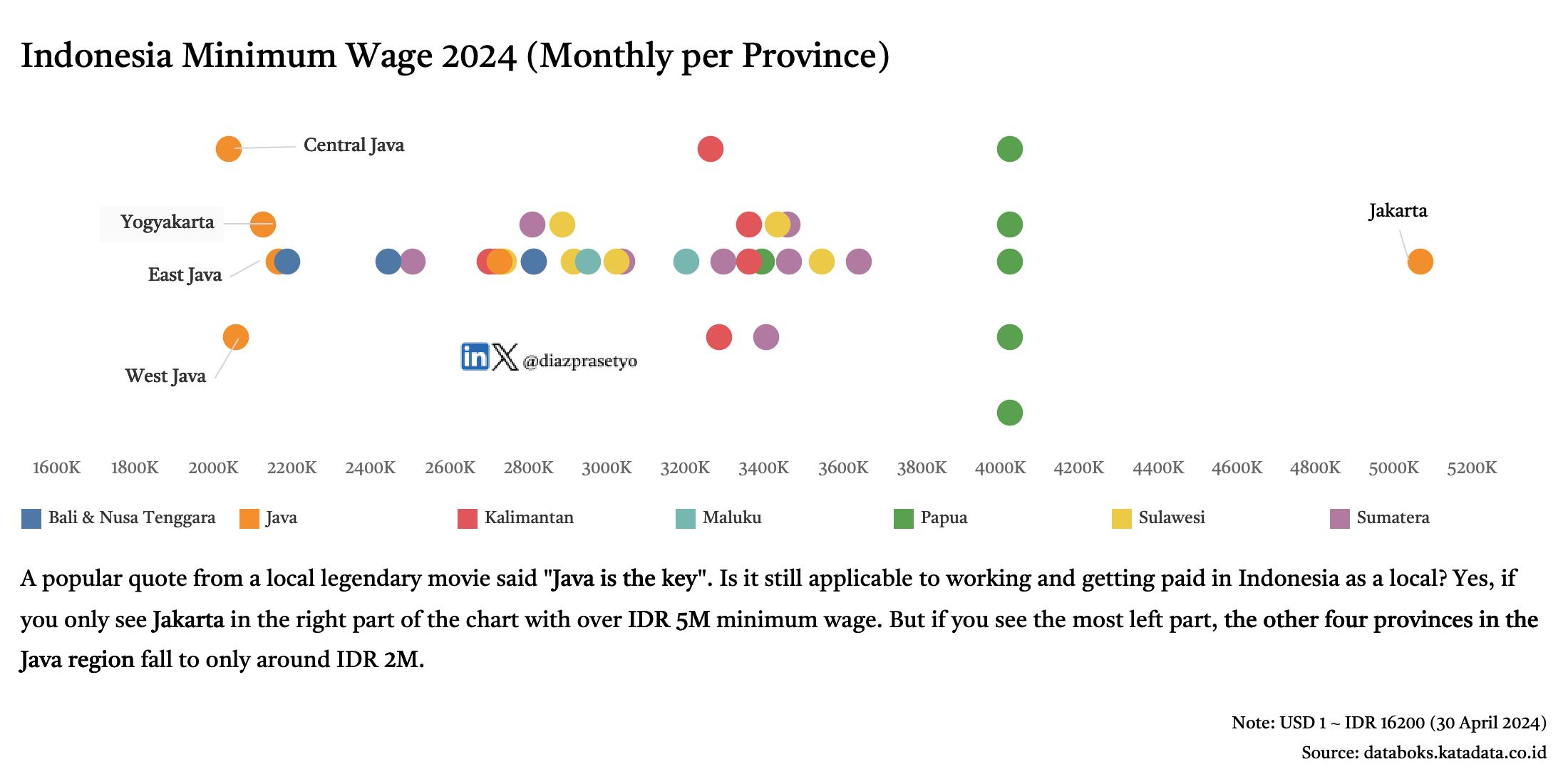
Day 30 FiveThirtyEight (theme day)
“Java is the key”. Is it still applicable to work and getting paid in 2024? Explore this @FiveThirtyEight-inspired viz
 Sydney Train Line using Network Chart
What I Learned
Creativity: Explored diverse chart types to find the best way to tell a story. Insights: Learned how to turn complex data into clear, actionable insights. Tool Mastery: Pushed the boundaries of Tableau to explore its full potential (with help from other #DataFam).
Explore the Full Collection of my #30DayChartChallenge
Check out all 30 charts on my Tableau Public profile: Link to Profile
Which of these visualizations stands out to you the most? I’d love to hear your thoughts and feedback!
Cheers.
#30DayChartChallenge #Tableau #DataVisualization #DataScience